Menu

Case Studies

Close

The Brief

The Essential Services Commission (ESC) promotes the long-term interests of Victorian consumers with respect to the price, quality and reliability of essential services.

The ESC had anecdotal evidence indicating that customers experienced difficulties when comparing energy offers and when engaging with retailers to change to an identified better offer. The ESC engaged U1 to conduct a focused review of individual and small business’ experiences in the retail energy market when comparing and switching energy offers, and particularly using comparison sites. The ESC was interested in learning about the pain points and complexities experienced by Victorian consumers and how this affected their levels of trust in energy competition.

Outcome

After facilitating a stakeholder workshop with the commissioners, U1 developed a two-stage research approach involving 40 participants across Victoria who represented a broad range of different consumers including individuals and businesses.

Part 1 involved a 90-minute session where we interviewed and observed participants as they researched and switched energy plans as they normally would. This included any conversations they had with energy comparators and retailers.

Part 2 was conducted two weeks later and involved a 30-minute follow-up interview with each participant to understand what had occurred since that first interview and to discuss their experiences. This included any further interactions they may have had with comparators and energy providers, what decisions they’d made, how they came to that decision and what the outcome was for them (e.g. if they had changed plans, providers, or decided to go back to their original plan).

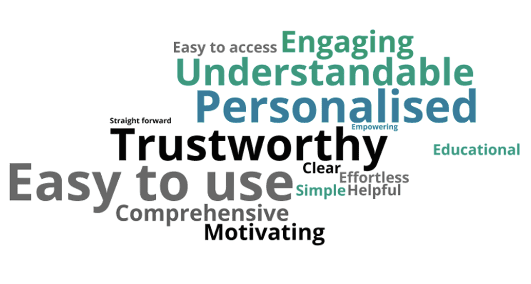
By observing and understanding the process of how consumers research the market to compare how their current plan compared to alternatives in the marketplace, and switching energy providers from end to end, U1 was able to deliver a comprehensive report which illustrated and organised the findings and recommendations. We identified clear pain points where consumers frequently misunderstood the information provided by energy comparators and retailers and were able to uncover a range of factors which contribute to consumer trust.

The key deliverables for this project were a detailed report, personas and current state journey maps that reflected the consumer experience and a presentation of the research to the Commission. The insights from this research will be included in the upcoming consumer competition review.

Woman working on laptop with child in her arms
Close

The Brief

Spotify is a global leader in music streaming with a 40% market share servicing 232 million active users.

The challenge was to remove barriers between low-effort users and a beautiful music experience, without compromising the tailoring options which high-effort audiophiles currently enjoy.

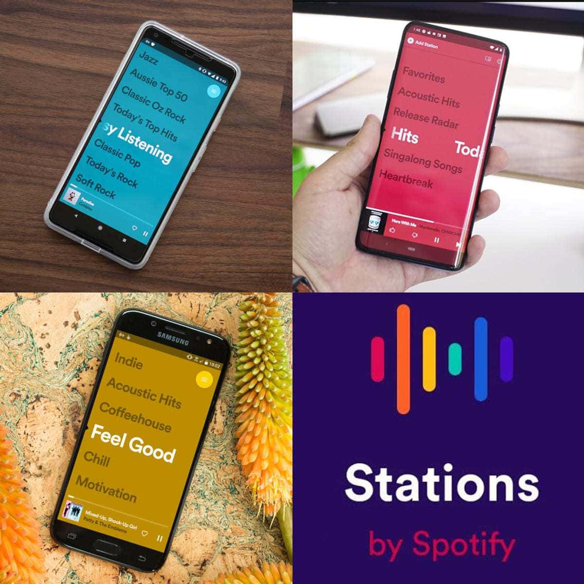
In response Spotify built a prototype of a simplified music streaming service which starts playing music instantly and has an interface reminiscent of scanning across radio stations. Originally titled Zero Tap Radio, this is now known as Stations by Spotify.

Spotify engaged U1 to conduct contextual research to deepen their understanding of the needs and motivations of low effort users in the Australian market whilst also identifying opportunities for improvement in the user experience of their proposed app.


Outcome

Working closely with the New York based design team, U1 conducted 24 contextual inquiries across Melbourne with participants identified as probable ‘low-effort’ users. U1 consultants visited the 24 participants in their homes or at their place of work to reach a rich understanding of the behaviours and values engaging with music.

Each visit explored;

  • Discussion around personal life, hobbies, and technology usage and integration.
  • A current state music experience: exploring where, when, why, and how users were listening to music. Their music goals, pain points, device and source preference were discussed.
  • Ideal future state music experience exploration, discussing how users envision the future of music engagement.
  • Reactions to Spotify Stations prototype. Participants used the prototype and provided their first impressions and discussed what worked well and what could be improved.

In addition to the contextual inquiries, U1 developed a detailed ‘Cultural Landscape’ report. This highlighted the emotional values and transactional behaviours of Australian users which may peripherally influence a user’s engagement with a new app driven musical experience.

For example, the desire for ‘a fair go’ among Australian consumers who often experience limited access to entertainment content due to regional licensing laws. Similarly, the high price of mobile data plans in Australia compared to other markets can influence streaming decisions among Australian consumers.

U1 delivered a detailed report of evidence backed design recommendations to improve the user experience. The report uncovered the pain points currently experienced by potential users and explored the ways in which Stations by Spotify can solve those pain points.

The report also detailed participant’s first reactions to the prototype, and any opportunities to improve the usability of the app.

Four personas were created to help illustrate user values and when paired with the cultural landscape report, ensured the international team was well prepared to empathise with and keep the user at the centre the design decision making process,

The Stations by Spotify app was released on schedule and received immediate praise, currently it is rated at 4.7 on the Apple app store and 4.4 on Google Play.

Close

The Brief

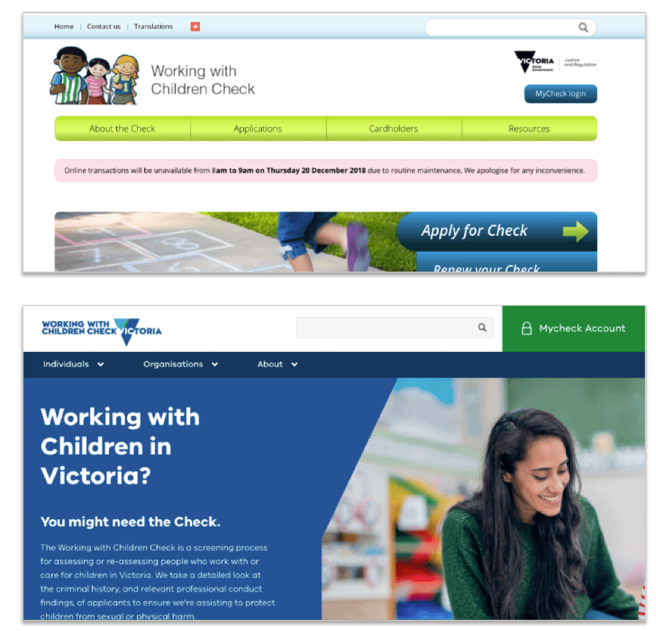
Deliver a completely new website which provides a positive, modern user experience for its target audiences and ensures people users can complete the tasks they visit the site to do.
The new website should minimise the time and effort users spend finding and understanding the information they seek and completing transactions.
as well as minimise the number of calls and emails to the WWC Check Unit’s Customer Support team, from people seeking information that is on the website.
Lastly it should maximise user confidence in the site at the different stages of their involvement with the scheme.

Outcome

In response, U1 led a collaborative approach. As experts in user research we wanted to work with the best in digital content and web design. By combining efforts with Avion Communications and Fluid we brought together three industry specialists.  The department of justice and community safety (DoJCS) enjoyed streamlined project management by liaising directly with U1, and was confident that the research and prototype validation was completed without bias.

The updated website was delivered on schedule and received immediate praise from users with a marked drop in web related queries and complaints.

  • U1 provided the research and design recommendations for the layout of the new site.
  • Avion provided the content and recommendations on writing for the web,
  • Fluid provided the website prototype.
  • U1 provided independently testing the prototype providing minor recommendations to the final design.
  • Fluid then integrated the recommendations into the final design.


Close

The Brief

Pitcher Partners provides a broad spectrum of specialised professional and individual services. They had identified that their website did not effectively support the complex ecosystem across the business. Although the main pages are updated regularly, fragments of outdated information across the site did not accurately reflect the culture and brand nor support the long-term goals of the national organisation.

Before investing heavily in updating the site’s structure and content, they wanted to discover how the site is being used, by whom and for what purposes. Additionally, Pitcher Partners wanted to understand if the site was meeting user’s expectations both internal and external and where it could be improved.

Outcome

U1 looked holistically at the business ecosystem and developed a multi-modal research approach, looking internally across Pitcher Partners as well as with both new and long-established customers.

U1 conducted separate discovery workshops with senior stakeholders and graduate interns,

One with the national marketing leads designed to;

  • Reveal assumptions about how internal and external users use the website,
  • Identify knowledge gaps in their understanding of the users, and
  • Define questions for later research stages.

The other with graduate recruits to;

  • Map the experience of applying to work at Pitcher Partners,
  • Understand the role of the website in their decision-making process when applying for graduate positions,
  • Uncover what professional and cultural expectations were developed when using the website prior to commencing at Pitcher Partners,
  • Discuss what changes could be made to improve the experience and the accuracy of the expectations developed by graduate recruits prior to starting,
  • Card sorting to prioritise communication methods.

U1 also conducted 15 in-depth interviews with partners, lateral hires and Pitcher Partner clients representing large and small contracts, new and established, and a range of professional services to understand;

  • What role does the website serve in their engagement with Pitcher Partners,
  • Does the website reflect the experience of engaging with Pitcher Partners,
  • What changes could be made to better serve the clients using the website,
  • With Pitcher Partner staff including senior partners and lateral hires covering a range of specialties to understand;
  • What their impression and understanding of the current site is
  • How they use the site currently and how they would like to use the site,
  • What goals do they have in serving clients, and how could the site support those goals.

By conducting both internal and external research, the findings were triangulated across all stakeholders in the business. This provided clear and reliable recommendations on how to address the needs and expectations of all users of the site, and ensured stakeholders across the organisation were consulted and invested in the new site direction. Pitcher Partners are using the insights and recommendations to inform the foundations of the long-term website strategy.


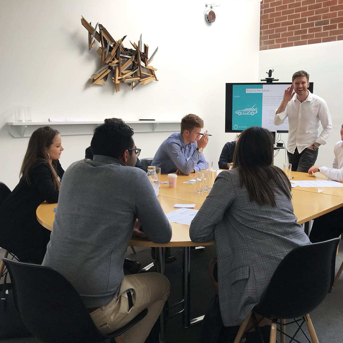
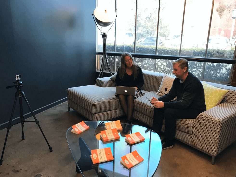
Participants engaging in a design research workshop
Close

The Brief

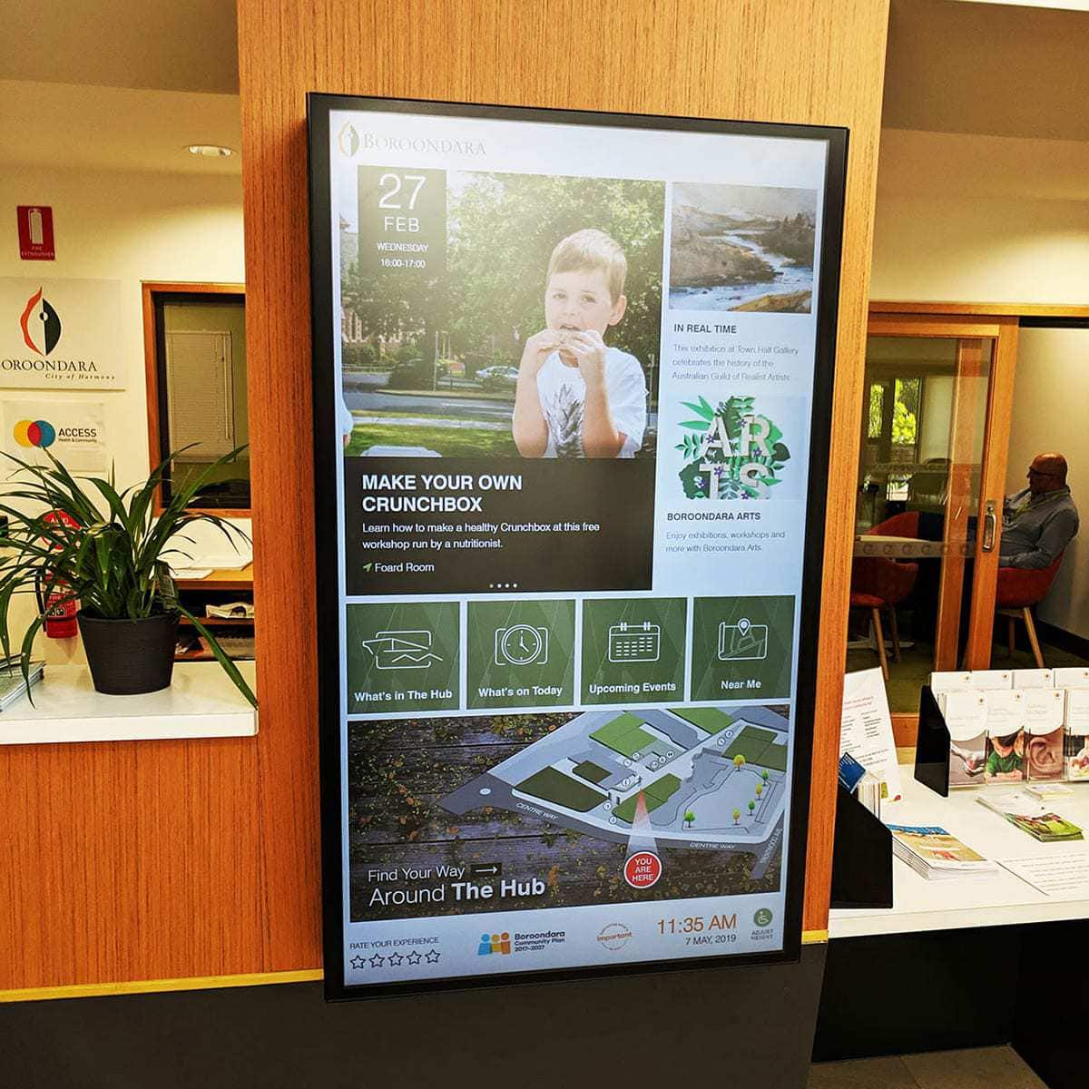
Deliver a research backed digital signage strategy which determines where and how digital signage is the appropriate mechanism for providing information and interactions of value to customers based on their needs across the City of Boroondara.

Outcome

U1 developed three resources to guide the selection, installation and governance of digital signage across the City of Boroondara.

        1. An implementation policy and framework document which establishes standards for Council to follow when using digital signage and details how to select the most appropriate type of screen to ensure the content is effective. The document maps site specific immediate improvements which can be made with minimal expenditure, and long-term improvements which require significant investment to become leaders in digital customer experience.
          The framework includes clear governance requirements describing roles and responsibilities to see that signage is well used, supported and maintained for the long term, bringing value to Council’s customers.
        2. The strategy itself which covers in detail how Council should best approach digital signage from today until 18 months into the future. The strategy defines what is (and what is not) digital signage, and provides clear recommendations on how digital signage can address a comprehensive range of customer needs.
        3. A detailed matrix of screen types and content types, produced in Excel format to allow for easy filtering by venue, content type, frequency of update and whether it is more suitable to a display screen or an interactive screen/kiosk. The matrix also indicates the priority to Council and users and scope for impact.
Close

The Brief

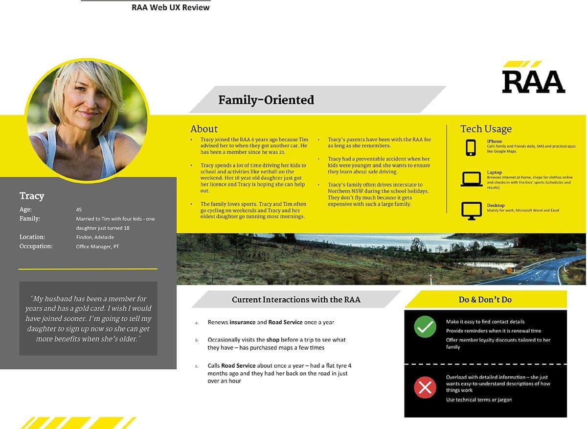
Eighteen month after launching its new website, RAA recognised that the site was not meeting its full potential in helping deliver on the strategic plan. The team was keen to understand issues standing in the way of members and other users of their website being able to more easily ‘self serve’.

Outcome

It was clear that members value the “human touch” services of the RAA and being a part of a local organisation. We grouped our Future State Recommendations into themes that mirrored RAA’s business strategy, to help them prioritise different ‘pain points’ and to support the internal adoption of the initiatives. The roadmap included recommended projects to increase engagement with members, to adopt staff training programs for content and usability, and introduce personalised content for members.

Project: RAA
Close

The Brief

Industry Funds Services (IFS) provides a range of  financial planning, insurance and investment solutions to industry super fund members throughout Australia.

IFS wanted to explore the viability of developing a suite of online tools to help industry fund members to better understand their superannuation choices and make super and financial related decisions.

IFS engaged U1 to conduct discovery research to investigate the needs and expectations of industry fund members when making decisions about their super and retirement, and explore their use of digital advice tools (also known as ‘robo advice’) to help with their financial decision-making. This research would provide insights to help IFS in its design and development of a new suite of digital tools to assist industry super fund members with financial advice.

IFS wanted an approach that delivered on its objectives in a cost-effective way and opened up the opportunity for a diverse range of industry fund members to participate

Outcome

We chose a mix of qualitative and quantitative methods for this project to ensure that we could explore the how’s and why’s of participants’ financial choices, behaviours and preferences through depth interviews and workshops and then validate our key findings with an online survey.

We recruited a mix of participants who were;

  • At different stages of their superannuation and financial journey,
  • Had different occupations and salary ranges,
  • Had different levels of knowledge about and engagement with robo advice tools,
  • Who lived in different areas of metro, regional and rural Australia.

The project was divided into three sprints:

  1. First, we conducted 12 in-depth customer interviews to explore their needs, attitudes and expectations in regard to making financial decisions (super and non-super related). The interviews probed current experiences and future expectations and used examples of current digital tools to stimulate the discussion.
  2. Next, we moderated two workshops, each with eight participants, to further explore customers’ needs, priorities and preferences, particularly in regard to using robo advice to support financial and super-related decisions. The workshops explored participants’ greatest financial and super concerns and their preferred sources of advice. The group format allowed participants to share knowledge and discuss various digital advice tools including their preferred features, how information was communicated and presented and what they expected to do with the information.
  3. Finally, we conducted an online survey completed by 150 respondents which quantified and validated some of the key themes and opportunities arising from the interviews and workshops. Themes we explored included tools and sources for financial decision-making, frequency of digital tool usage, device and feature preferences, confidence in using digital tools and next steps after using digital tools.


U1 provided a detailed report and verbal debrief at the end of each sprint of the project. The debriefs provided an opportunity for us to collaborate with IFS in the design of each follow-on stage, using the findings to inform the specific line of enquiry for the next phase of research.


U1 also developed a consolidated report which allowed us to focus more closely on key themes arising across the entire project. The report identified the specific advice needs and preferences of each market segment, detailed potential barriers to the uptake of digital tools (and ways to mitigate against these challenges) and included a high-level  ‘personal advice’ journey map and prioritised feature list.


Overall there was a strong correlation of findings, both with IFS’s own internal research and across the three stages of this research project, allowing IFS to confidently approach the next phase of its digital tool design and development with a robust set of findings and recommendations.


Close

The Brief

AGL launched a pilot program with Melbourne based customers for a product called ‘Solar Exchange’. This program allowed AGL’s solar customers to trade the excess energy they generate from solar panels and don’t use at home, with either family and friends or the broader market. Once the pilot was underway, AGL wished to gain insight into participants’ experience of the program and product, with a particular focus on:

  • assessing the effectiveness with which collateral explained what the product is and how it works
  • understanding perceived benefits of the product as well as potentials barriers to uptake
  • identifying opportunities for improving both the product itself and the associated digital experience

Outcome

The service walkthroughs and contextual inquiries delivered insights into the end-to-end customer experience associated Solar Exchange, from initial product discovery and sign-up through to receiving a bill. Conducting home visits provided context into how and where customers engage with the product. The online survey allowed validation of qualitative research findings and provided additional confidence to the Solar Exchange team when making product related decisions.

As a result of this research, AGL were able to identify some quick wins for improving the digital experience of the Solar Exchange product. They also came away from this project with a greater understanding of the motivations and expectations that influence decision-making related to this type of product. These insights all fed into the development roadmap for this product.

Testimonial:

AGL engaged U1 to better understand the experience of customers participating in our peer-to-peer solar energy trading pilot.

The contextual inquiries were performed expertly and respectfully, producing great insights into customer experiences, attitudes, and thoughts about the trial. We discovered reasons why customers were and were not referring their friends to the platform, and to what extent the pilot had met their expectations.

The quantitative survey was well designed and executed. It helped us unlock new ways we could improve the customer experience through better a communication strategy and digital experience.

Thanks to U1 we are now using the customer insights that came out of this research to guide our product development roadmap and to improve experience for our customers.

Brendan Whelan – Product Manager

Close

The Brief

Aiming to make government transactions more streamlined and simpler, Service Victoria engaged U1 to conduct an ongoing program (fortnightly) of moderated user research, including usability testing and depth interviews, in order to gather feedback on the user experience of completing transactions from across a wide range of Victorian government agencies on the Service Victoria site.

The goals of testing were to:

  • Provide actionable insights and recommendations to ensure Service Victoria produces an accessible and centralised platform for conducting Victorian government service transactions
  • Understand potential barriers for entry when engaging with Service Victoria over a government agency; and the perceived benefits of engaging with Service Victoria over those agencies
  • Identify usability pain points of the transactions/features
  • Understand how content and language along with navigational flows, meet the needs of users across differing segments
  • Understand users’ needs and expectations for rolling out new site features

Some of the types of transactions and site functions that were tested across the project were:

  • Working with Children Check (Volunteer, Employee, Volunteer to Employee)
  • Ambulance Victoria membership (Single and Family)
  • National Police Check
  • Register a party with the Partysafe program
  • Register absence from residence
  • Chatbot feature
  • Identity Verification Processes
  • Digital wallet concept

Outcome

Through fortnightly testing U1 was able to work collaboratively with Service Victoria through each sprint cycle to provide clear recommendations to improve the user experience, ensuring users received transactions and features that best reflected their needs.

Multi-round research ensured insights and recommendations from previous rounds were incorporated into design and development, eliminating usability issues.

U1 was able to help supplement Service Victoria’s understanding and further define the needs, behaviours, motivations and expectations of its users when interacting with the state government online.

With hundreds of Victorian government sector transactions available across 540 websites, Service Victoria is working towards streamlining these transactions on the one platform. Currently, Service Victoria supports 16 high volume government transactions.

Close

The Brief

The Envato group of companies operates several global ecommerce sites trading in digital creative assets and services, including two marketplaces – ThemeForest and CodeCanyon – where users can buy and sell web and code assets.

Envato wanted to learn more about their prospective customers from key markets in North and South America, Europe, and West Asia.

They engaged U1 to conduct qualitative research with a mix of website coders and developers from around the world. Participants worked on web and game projects for large organisations, in small-medium digital agencies or as freelancers.

Envato wanted to understand:

·      How coders approach their projects including clients, workflows and teams, and the types of challenges they face day-to-day
·      What tech they use for projects, why they use these particular tools and how they use assets such as templates, themes and plug-ins
·      Their awareness of, or engagement with, Envato and its products
·      Their thoughts on the digital tech industry and where it is heading in the future

Outcome

To cover Envato’s required range of markets, we conducted 50 one-hour remotely moderated interviews with web and code professionals in the USA, UK, Germany, France, Turkey, India, and Brazil.

Perhaps the greatest challenge of this project was coordinating the recruitment and scheduling of participants across seven countries, 16 time zones and multiple languages.

We took a multipronged approach to recruitment using online recruitment platforms to source and schedule participants in the USA, UK, Germany and France and partnering with local UX and recruitment companies in Turkey, India and Brazil.

In countries where English was often a second, third or fourth language, prospects sent us a short biographical video to help us gauge their level of spoken English competency and finalise our shortlist. We also used an interpreter for our Turkish sessions allowing participants to express themselves more fluently in their first language.

While we recorded each session, the Envato team could also observe interviews in real-time via U1’s online live streaming portal.

To help manage the volume of data coming out of the sessions, we set up a collaborative online space using Miro where we collated and updated themes, posted verbatims and developed a matrix of our findings and recommendations as we progressed through the interviews.

As well as providing the opportunity for the Envato team to explore and contribute to findings as the project progressed, the Miro board was an excellent platform for synthesising our data, compiling our final report and debriefing the client at the end of the project.

This research helped Envato to glean important insights into the attitudes, behaviours, challenges and choices of their prospective customers from around the world.

Envato has used the findings to seed and refine strategies to better target their customers globally.

The project also established a flexible process for conducting affordable global research and set benchmarks that Envato can use in future, ongoing studies.

Close

The Brief

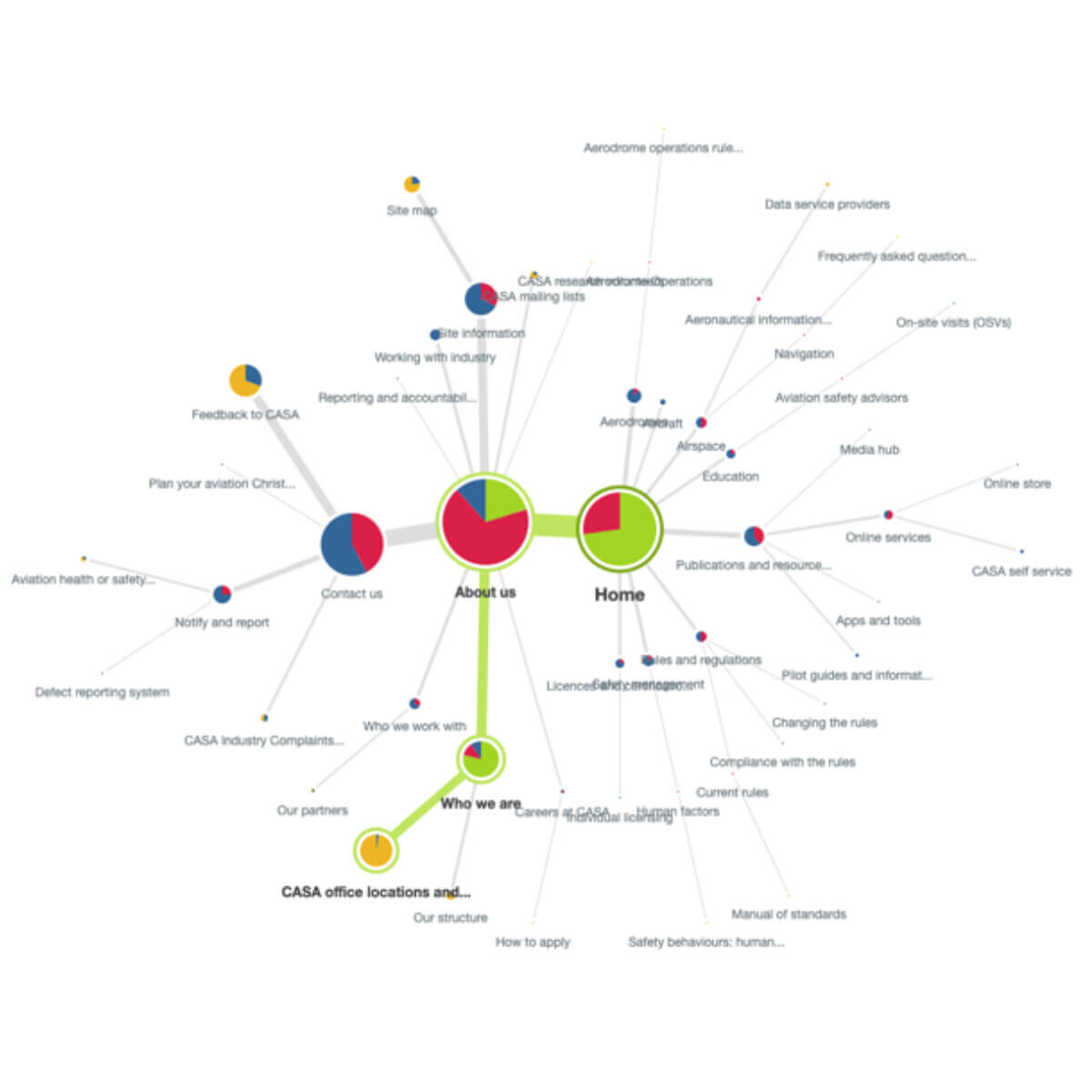
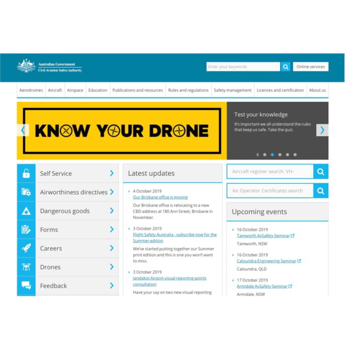
The Civil Aviation Safety Authority (CASA) is a federal government body that regulates Australian aviation safety. With an audience that is broadening and growing significantly with the ever-increasing usage of drones, CASA identified a need to review their website’s Information Architecture (IA).

The primary goal was to determine how well the current IA is meeting the needs of the current audience and to identify opportunities for improvement that will support both current and future audiences.
Given the breadth of these audiences, we recommended a multi-stage approach to the project. This included a series of workshops and interviews with internal stakeholders, a content audit, an online IA Validation supplemented by a series of one-on-one interviews, and a moderated card sorting workshop with a representative sample of CASA website users.

The outcomes of this activity led to the creation of a draft proposed IA for the CASA site. From here the draft IA was iterated and refined through a series of online IA Validations until a final version was agreed upon.

Outcome

The final proposed IA retained some elements of the existing IA whilst substantially altering other elements. This approach significantly improved the findability of content, with the final IA Validation of the proposed IA outperforming the existing IA, delivering close to a 3-fold improvement in task success.

The consultation process and feedback from users indicated an overall preference for a topic rather than audience-based approach to the IA. This was identified as a more scalable approach to organising content on the site.

Whilst the final IA was primarily topic based, we also recommended incorporating an interaction design element on any future version of the site that provided a curated view of key content by audience type.

Close

The Brief

The Butterfly Foundation (BF) is the national not-for-profit organisation supporting Australians impacted by eating disorders and body image issues.

BF wanted to understand the pathways in which consumers engaged with (and accessed) eating disorder and body image resources and services.

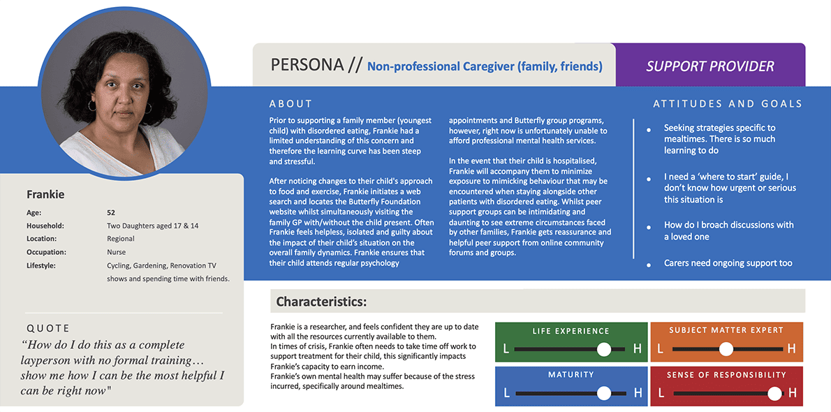
This foundational piece of research was intended to inform the creation of personas that will aid in the development of future resources to address the specific needs uncovered in the research.

Both depth interviews and workshops were structured as moderated discussions to explore experiences, behaviours and attitudes regarding participants’ access and usage of resources and support. Further exploration sought to understand how the participants experience the existing BF offerings, frequency of access and effectiveness of these resources.

Outcome

The nuanced nature of this research lead to the identification of several key opportunities and touchpoints for intervention, resulting in the creation of a suite of actionable tools; prioritised recommendations, detailed personas and accompanying journey maps.

Using these tools, Butterfly Foundation can confidently apply insights to future initiatives (support and resources) and enhance the stakeholder experience across the ecosystem.

For the full report which has been published on the Butterfly Foundation website, see link below:

https://butterfly.org.au/wp-content/uploads/2023/12/U1-Butterfly-Foundation-Consumer-experience-pathway-Debrief-Report_v2.pdf


Close

The Brief

REA wanted to explore and map the common elements of the current state first homebuyer journey.

U1 were asked to uncover insights about consumer needs and motivations, to get clarity and understand which tools and resources are currently being utilised at each overlapping phase of the first homebuyer journey.

Of particular interest to REA stakeholders was to understand if, and when, the finance journey and property search journey overlap.

Outcome

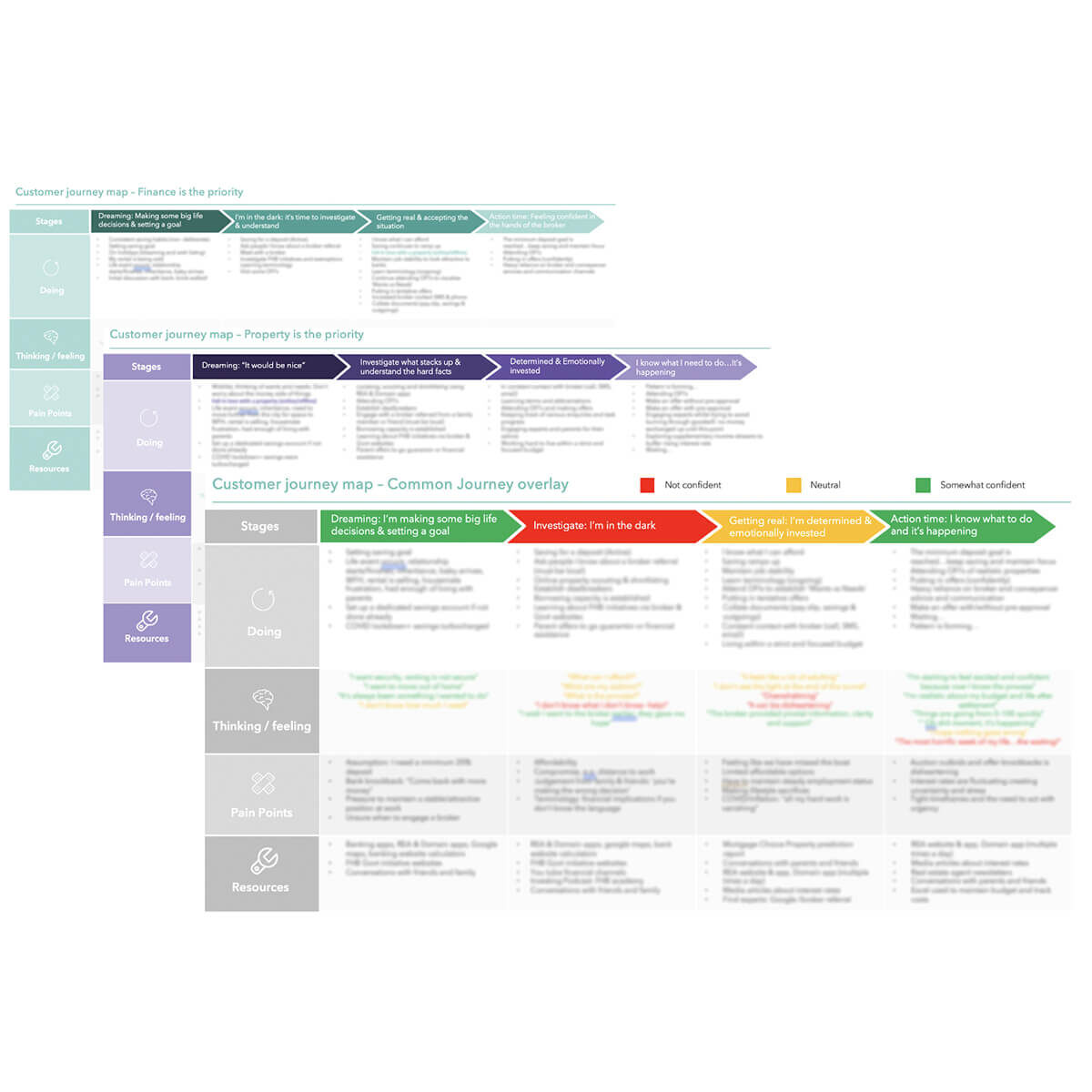
During the sessions, both moderator and participants populated a MIRO board, cocreating a visual representation of the consumer’s research, finance, and eventual purchase journey.

Through this research we were able to identify previously unknown customer motivators that pinpoint why some customers prefer a finance-first approach, whereas for other customers the property is the driving motivator in their first home buyer journey.

U1 provided REA with a suite of key customer journeys to allow prioritisation of future intervention initiatives.

In addition, our research was able to identify important phases within the existing customer journey, where opportunities exist for competitive advantage and better stakeholder engagement.

Close

The Brief

Pulse wanted to learn about how customers within the key global markets of North America, Europe and the UK, utilised the Pulse software as part of their regular workflow, and then compare these different use patterns by market.

U1 were engaged to conduct remote qualitative group workshops to gain insights into how (and why) these users from different disciplines used Pulse as part of their everyday workflow, where overlaps or non-linear workflow processes occur and common user workarounds. In addition, feedback was sought on prototype concepts to identify any barriers or opportunities that may be encountered when using the new designs.

Outcome

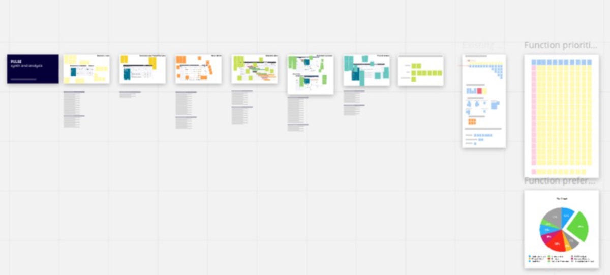
To help manage the volume of data coming out of the sessions, an online Miro board was set up to collate themes, post verbatims and develop a matrix of preferred features as we progressed through the synthesis phase. The Miro board also provided a flexible and collaborative tool to debrief the client at the end of the project.

U1 was able to identify important user-preferred features and uncover design opportunities that would result in immediate positive impacts on user workflows, as well as provide Pulse important insights into the attitudes, behaviours, challenges and choices of their current and prospective users from around the world.

Pulse will use these insights to refine concept designs and strategies to better align with their customers’ workflow globally.

Close

The Brief

The Civil Aviation Safety Authority (CASA) had embarked upon a large-scale user experience design program with the aim of transforming current digital services and designing new ones.

An agile approach was applied to this program of work, with two-week design sprints implemented to produce stimuli or prototypes for validation by real users of CASA’s digital services.

Working with the CASA team, U1 were engaged to conduct usability testing on their behalf in support of each design sprint, across the course of 8 sprints.

We established a rhythm of holding a briefing session on Day 1 of each sprint, culminating in the presentation of a report and walk-through of research findings on Day 9 of each sprint.

Outcome

Each round of usability testing culminated in delivery of detailed report and debrief via video conferencing with the CASA team.

  1. The CASA team received the insights required to iterate the design of digital services (such as the myCASA account creation process) and maintain their rhythm of fortnightly design sprints. This led to an improved user experience of CASA’s digital services.
  2. Despite both teams being based in different cities (CASA in Canberra and U1 in Melbourne), a seamless, well-integrated, collaborative approach to both the planning of research and delivery of research findings was achieved.
  3. The CASA team’s understanding of their audience was greatly enhanced, particularly in relation to a potential new online service (which is currently confidential). The insights from research related informed the Authority’s decision-making in relation to this particular service.
Close

The Brief

One of the large banks wanted to explore the customer experience of unboxing and activating their new bank card which was part of a new internet-only banking product. With a unique delivery process and packaging, our client was keen to test this physical component, along with the end-to-end flow of the product’s setup and activation steps, which are completed using a smart phone app.

Our client engaged U1 to conduct contextual research to capture customers’ reactions and experiences first-hand using high-resolution prototypes of the card, packaging and smart phone app.

Outcome

The physical nature of this research, coupled with the ability for our client to discretely watch participants’ behaviours in detail, gave the design team important insights into the user experience of the card and packaging, and the flow of steps in the activation process.

Using these insights, our client has now redesigned some aspects of the packaging to make the unboxing more intuitive and modified the smart phone app to better reflect users’ behaviours and expectations when activating their card.

Close

The Brief

The City of Melbourne (CoM) wanted to understand the visitor experience of infrequent or new visitors to Melbourne when undertaking one of the self-guided walking tours offered by their ‘What’s on’ website/ visitor hub.

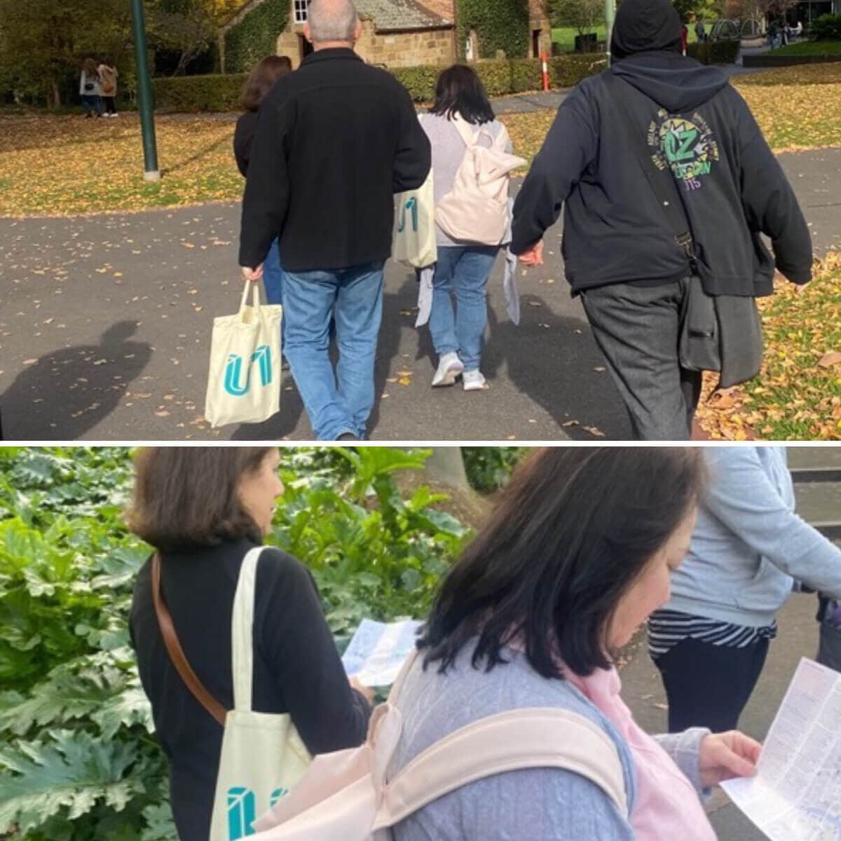
U1 was engaged by CoM to conduct observational research to identify content gaps, accessibility issues, safety and cleanliness pain points encountered across the 3 most popular walks – Laneways and arcades, Street art, Parks and gardens.

This research required participants to undertake a 2-hour self-guided tourist walk through the City of Melbourne as part of a group, using different formats of the map (paper vs mobile). The participant cohort was a mix of gender, age, and level of lived experience as a carer of someone with accessibility needs. All participants had either recently moved to Victoria from interstate/overseas or lived regionally/in the outer suburbs.

Participants attended an initial 20 minute Zoom session prior to the in-person group walk. This facilitated an icebreaker between participants and resulted in discussions about their expectations and previous travel.

Outcome

The research was able to identify visitors’ expectations of the walking maps, including related points of interest, facilities, and accessibility suggestions. These insights were segmented into walk-specific findings and overall common findings that applied across all 3 walks.

Several key recommendations addressed structural barriers to the walk content encountered by participants, specifically in relation to the time of day (am vs pm), safety and the importance of history and context to gain a better understanding of place.

Participants were able to identify content and technology improvements that would enhance the experience by reflecting on their time spent living or travelling abroad, citing specific relevant examples that could be employed by CoM in future design iterations.

Simultaneous to the content insights, usability recommendations for both mobile and paper-based versions of the walk maps were able to be generated.

Preferences for how the maps were used provided CoM with insights about visitor mental models and suggested strategies to confidently redesign the maps for visitors new to the city in a post-Covid era.

Get in touch

Find us at:

Level 24, 570 Bourke Street,
Melbourne VIC 3000
(03) 9684 3470

Email: info@u1group.com

Online enquiry