There’s nothing like a long, burdensome form to make participants reel back in pain during user testing. The sheer sight of a form can be enough to divert users down an alternate path or cause them to abandon their journey altogether.
But what if there existed a means of solving the issues caused by arduous forms? Natural language forms attempt to address both of these problems by letting users create their own story, weaving a personalised narrative which details both who they are and what they want to do.
What is a natural language form?
While traditional forms have rows of individually labelled text fields and dropdown menus, natural language forms enable users to build a coherent sentence by selecting options which are tied together by linking words. The text fields can be modified using a dropdown menu, allowing users to identify the relevant option from a list of predetermined choices.
Types of natural language forms currently in use
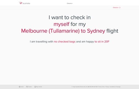
Natural language forms are increasingly being used in web and app design. For example, Virgin Australia uses a natural language form in their online check-in process. Passengers can select the red text to change things such as: the flight they are checking in for, luggage allowances and their seat.

This example shows a natural language form being used to replace a traditional form.
It works well because users expect to answer questions and provide information during the process. But what if a natural language form was used not to replace a traditional form, but as a navigation alternative?
Natural language forms as a navigation alternative
While forms are more than capable of causing headaches for users, even more so are information architecture structures that users can’t make sense of, either because the labelling is unclear or there is myriad options to choose from.\
Recently, U1 conducted user testing that involved observing users interact with a natural language form that served as an alternative navigation option (the website also had a main navigation menu).
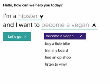
The form allowed users to identify themselves and their task using dropdown menus, then click a submit button that would take them to the appropriate page. For example, users could identify themselves as hipsters who want to find out about becoming a vegan.

Prior to testing, I was excited by this feature and its potential for solving information architecture issues whilst creating a more personalised user experience. The realities of user testing however, exposed some issues which greatly affected the form’s ability to assist users in their tasks. The following outlines our observations.
Users preferred the main navigation menu over the form
The natural language form really was the hero piece of the homepage. Extremely prominent, it boasted some valuable real estate beneath the main navigation menu. However, users preferred the main menu over the form in every task. It should be noted that the information architecture of the site tested well, so there was very little need for users to resort to an alternative such as search or the form.
Users did not realise they could alter the sentence
The most valuable insights came when we asked users to interact with the natural language form. We had two segments of participants: hipsters and non-hipsters. When we asked the non-hipsters to interact with the form they became puzzled.
“But I’m not a hipster – so this isn’t for me. I would have read that and thought that must be the number one reason why people get in contact.”
Users did not realise that they were able to manipulate the form to suit their requirements. This was due in part to unfamiliarity with the concept, but also because users did not realise that the dropdown menu links were clickable.
“I didn’t realise you could click on that. I thought that was just one sentence.”
Even when we asked the non-hipsters to change the form to suit their needs they were extremely hesitant. The developers foresaw this issue and decided to animate the downward pointing arrows, implementing a vertical bouncing motion. As demonstrated by users reluctance to interact with the form, this tactic did not seem to offer the affordance they hoped for.
Users thought the interactive elements were hyperlinks
Even hipsters had trouble with the form. For example, we asked some hipsters to use the form to find out information on becoming a vegan. Some hipsters thought that the green underlined text ‘become a vegan’ was a hyperlink. When they selected the text they were surprised, because instead of being taken to a page with information about becoming a vegan they were shown a dropdown menu.
“I’m guess I’m used to [the fact that] if something’s underlined, you can click on that and go somewhere else.”
This may have been due in part to the action oriented text – ‘become a vegan’. Users skimmed over the other text, seeing only the underlined words that contained their task. This led to frustration when the interaction did not meet their expectations.

Users unable to see the whole
The major failing of the form was that users were unable to grasp its core concept. Users did not realise that the purpose of the form was to use both dropdown menus to form one complete sentence. They did not see the link between the ‘audience’ and the ‘task’ sections of the form, which compounded the other issues we observed.
Users didn’t understand ‘Submit’
Users saw the call to action for the form as being separate from the form itself. They seemed unsure as to the purpose of the button.
“There it says ‘Let’s go’ – I’m not sure what that’s about.”
If users did use the dropdown menu to change the options, they did not take the next step of using the submit button to action the sentence they had created. Even if the user was a hipster who wanted to become a vegan (the form’s default setting), they would still click ‘become a vegan’ before getting close to the ‘Let’s go’ button.
Consider the context
We still see natural language forms as an exciting innovation that has a lot of potential to enhance user experiences. However, the context in which they are used in should be carefully considered.